
Wanderers Day
Turning a layout that deliberately breaks the standard grid into something that still loads fast, scales cleanly across devices, and holds up in search.
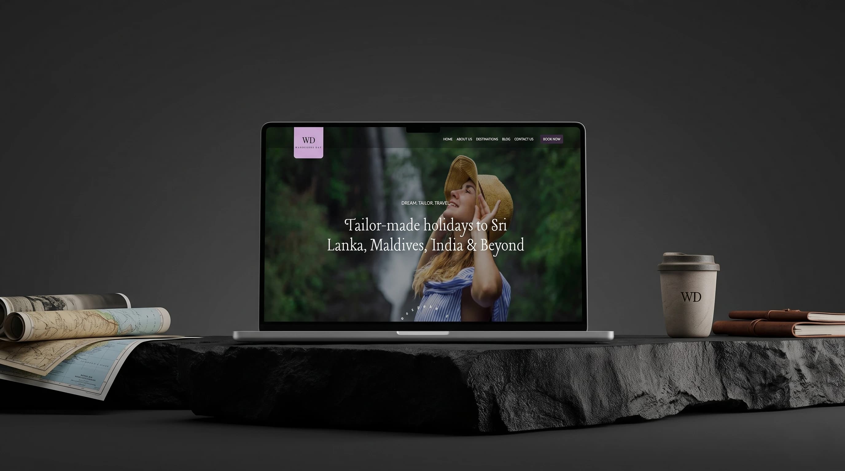
A layout built to break the standard grid is also a layout that's hard to keep responsive.
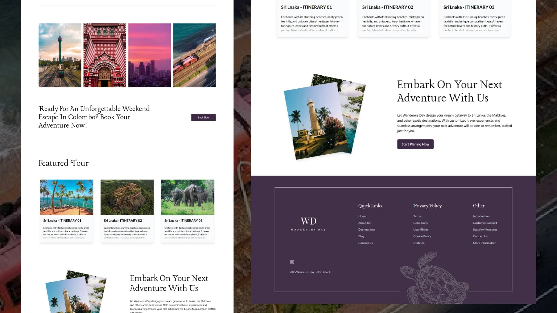
The design moved away from typical travel-site templates with overlapping elements and non-standard grid components. That's exactly the kind of layout that tends to fall apart at awkward breakpoints, so the challenge was holding perfect responsiveness across mobile, tablet, and desktop without flattening what made the design distinctive, or losing animation fluidity in the process.
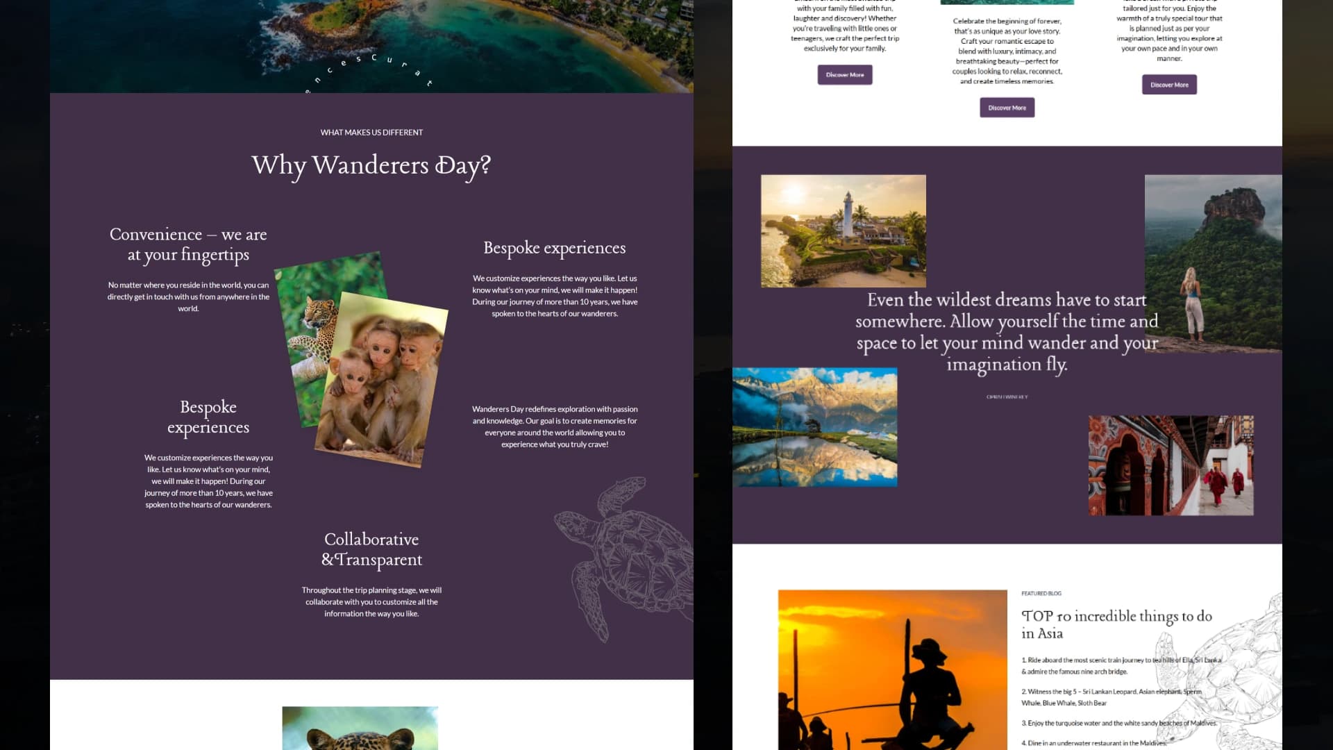
Built modular, tested at every breakpoint, indexable from the start
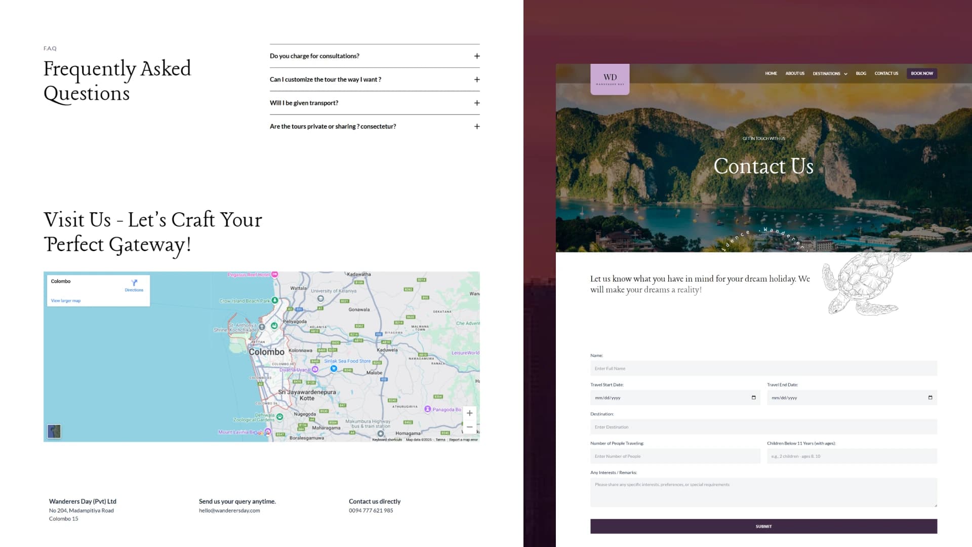
I built modular, flexible sections in Tailwind CSS and tested them thoroughly across breakpoints. Hiru Withana led design and build on the home and contact pages; the rest of the site, including the SEO foundation below, was mine.
Meta tags, OpenGraph, and Twitter card data set per page so shared links and search listings render properly.
Structured markup with a clear heading hierarchy, even across the more non-traditional grid sections.
Descriptive alt text across destination and tour imagery for indexability and accessibility.
Lazy-loaded, optimized image assets so the visual storytelling doesn't come at the cost of load time.
Non-standard layout, standard discipline on performance
Breaking the grid visually didn't mean breaking the rules on what actually keeps a site fast every animated or sliding element still had to justify its cost.
Scroll-based micro-interactions tuned for fluidity without jank on lower-powered devices.
Tour and destination sliders built for smooth touch and pointer interaction across devices.
Every non-traditional grid section tested and adjusted individually across mobile, tablet, and desktop.
Utility classes kept styling consistent across custom components without a bloated stylesheet.
A layout distinctive enough to stand out, disciplined enough to still perform
The site holds its unconventional visual identity across every breakpoint, without the SEO foundation or load performance becoming the tradeoff for that distinctiveness.
Got a messy platform or a new idea?
Skip the guesswork. Pick a channel below and let's figure out the smartest UX strategy for your business goals.
Drop a message and I'll get back to you within 24 hours no templates, just a real reply.
SEND A MESSAGE ↗SEND A MESSAGE ↗Follow along for case studies, design breakdowns, and occasional thoughts on building better products.
CONNECT ↗CONNECT ↗