Pressvia Website
Scaling a tech & business news site from 5 categories to 30+ subcategories and turning ad placement from a readability liability into a ~40% revenue gain without it feeling like a cluttered news site.

Most news sites solve growth by adding more more categories, more ad units, more competing CTAs. That usually breaks readability first.
Pressvia Team wanted Pressvia to cover tech and business news the way The Verge, Wired, and TechCrunch do broad enough to need real taxonomy, but never at the cost of the reading experience. That created two compounding problems I had to solve together, not separately: how do you structure navigation for a catalog that was going to grow from a handful of categories into dozens of subcategories, and how do you monetize that traffic with ads without the page turning into the cluttered, ad-saturated layout the client was explicitly trying to avoid.
Most teams treat IA and monetization as separate workstreams. I treated them as one constraint: every navigation and ad decision had to earn its place against readability, or it didn't ship.
Studying how the best editorial sites earn density without clutter
I audited The Verge, Wired, Business Insider, and TechCrunch specifically for how they handle the two hardest problems on this project: deep category taxonomies and in-article ad density. Each gave a different piece of the answer.
Heavy use of visual hierarchy and whitespace to make a large taxonomy feel navigable rather than overwhelming.
Who this had to work for
I didn't run a formal research study at launch, so I built two working reader profiles from the content strategy itself, who Pressvia's tech/business journalism is actually for and used them to pressure-test every IA and ad decision before it shipped.
The Scanner.
Arrives from a search result or social link, reads one article, decides in seconds whether to explore further. Needs category context without being forced to leave the article.

The Regular.
Returns directly to browse a specific beat say, AI or startups and needs the taxonomy to be predictable across visits, not freshly reorganized each time.

Designing for a taxonomy that didn't exist yet
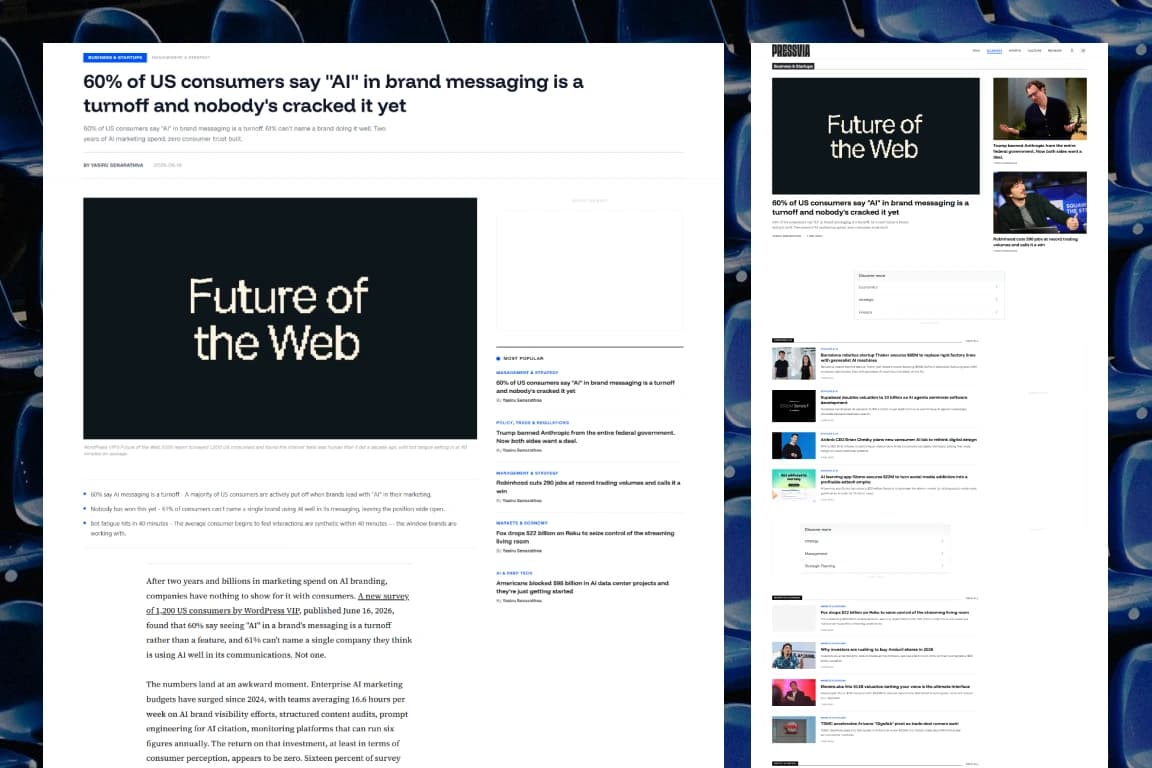
The brief called for 5 broad categories Tech, Business, Startups, AI, and Markets but each needed to support 5 to 8 subcategories as the content library grew, landing at roughly 25 to 30 live subcategory pages today. A flat dropdown couldn't hold that without becoming its own usability problem, and a deep nested menu would bury content the Scanner persona would never click through to find.
I resolved this with a two-tier model: each top-level category has its own landing page showing its subcategories with a preview of recent posts in each, and every subcategory has a dedicated page a reader can navigate to directly and bookmark. That kept the top-level nav shallow never more than one click to see the full breadth of a section while still giving the taxonomy room to grow underneath without ever needing to redesign the nav itself.
The first ad layout protected readability and underperformed. The fix wasn't more ads it was better-placed ones.
At launch, the article page used a deliberately conservative ad layout, since the client's whole differentiation was a distraction-free reading experience. It worked for readability, but revenue underperformed what the traffic should have supported. That set up a real conflict: every senior designer eventually has to make a monetization decision that touches the thing they actually care about, the reading experience.
Rather than treating "fewer ads" as the only readability-safe option, I went back to how Business Insider, Wired, and TechCrunch actually place ads inside long-form articles, and tested a revised structure: a single ad container above the article header, a sticky-contained unit in the left rail that scrolls with the reader instead of interrupting them, and four ad slots distributed through the article body at natural section breaks rather than at fixed scroll intervals. The difference wasn't ad count, it was ad placement logic every unit sits at a point where a reader's attention has already paused, not where it forces a pause.
After shipping the revised layout, ad revenue rose an estimated 40% against the original structure, and informal testing afterward showed readers didn't perceive the page as more ad-heavy, because the units were placed where attention had already shifted rather than where it was forced to. That's the actual lesson from this project: readability and monetization aren't opposites, they're both downstream of where you put things relative to attention, not how many things you put.
Informal, but honest about it
I didn't run a moderated usability study for this project it doesn't have that budget so I validated the navigation and ad layout with a small group of peers walking through the live site cold. The feedback that mattered: the category structure and overall cleanliness read clearly without explanation, and critically, nobody flagged the new ad placements as intrusive or blocking content, which was the one outcome that would have sent the ad redesign back to the drawing board regardless of the revenue numbers. Small and informal, but it was the right test for the actual risk in this decision.
This shipped, then kept changing on purpose
Monthly visits, 3 months post-launch
Revenue lift from ad placement redesign
Readability complaints flagged in informal testing of new ads
Pressvia's navigation and ad structure are still under active iteration, not because the first version failed, but because the content catalog keeps growing past what the original taxonomy anticipated. The two-tier category model and the section-break ad logic were both built to be revisited as the library scales, rather than fixed structures, which is the part of this project I'm most glad I got right early.

Got a messy platform or a new idea?
Skip the guesswork. Pick a channel below and let's figure out the smartest UX strategy for your business goals.
Drop a message and I'll get back to you within 24 hours no templates, just a real reply.
SEND A MESSAGE ↗SEND A MESSAGE ↗Follow along for case studies, design breakdowns, and occasional thoughts on building better products.
CONNECT ↗CONNECT ↗