
Massif
Designing the homepage, category grid, and product pages for a quiet-luxury clothing brand where every key detail had to be visible at a glance, not buried under a scroll.
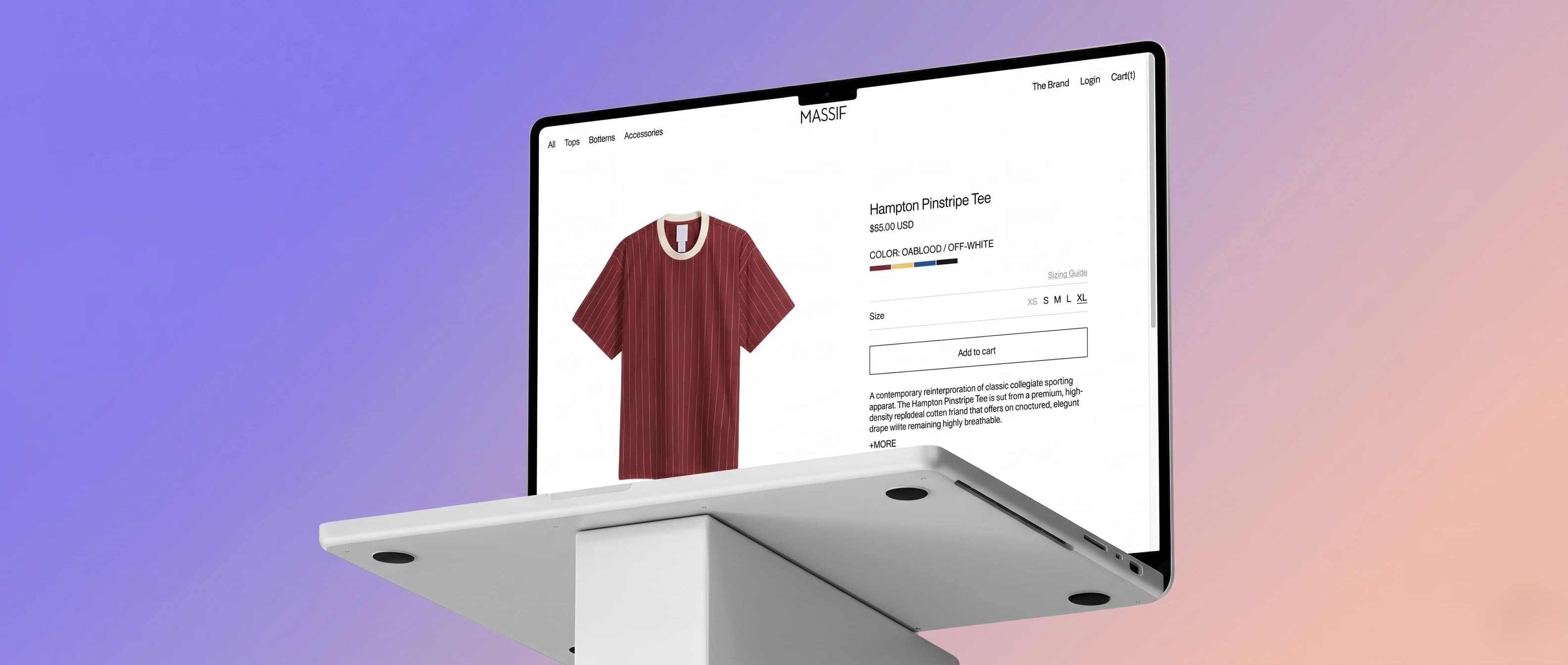
Quiet luxury is a hard thing to design loudly. It has to hold up under restraint.
"MASSIF was founded to create timeless garments shaped by the country's distinct climate and an elevated way of life. Drawing from a heritage of enduring resilience, each collection reinterprets essential pieces through a sharp seasonal contrast, balancing quiet luxury with technical refinement."
That brief sets the bar for the interface as much as for the clothing. "Quiet luxury" can't mean a homepage with nothing on it Massif's catalog spans headwear, knits, outerwear, and a seasonal collection that all need to be communicated clearly. The UI had to carry that same restraint: confident enough to not over-decorate, but structured enough that nothing important gets lost in the quiet.
No formal research phase here just a close look at how other DTC menswear brands handle the same problem
This wasn't a research-driven process with interviews or surveys there wasn't a budget or timeline for that. What I did do was look closely at how other premium DTC menswear sites structure their homepage and category pages, and one pattern showed up consistently enough to design around it.
Across most of the sites I looked at, the things a visitor actually needs first current collection, pricing direction, what's new, key categories were pushed below the fold behind a single oversized hero image. Getting oriented on the site meant scrolling first and understanding second. For a brand built on "quiet luxury," that's the wrong kind of quiet it reads as withholding information rather than restraint.
If the layout needs a scroll to make sense, it's already lost the first few seconds
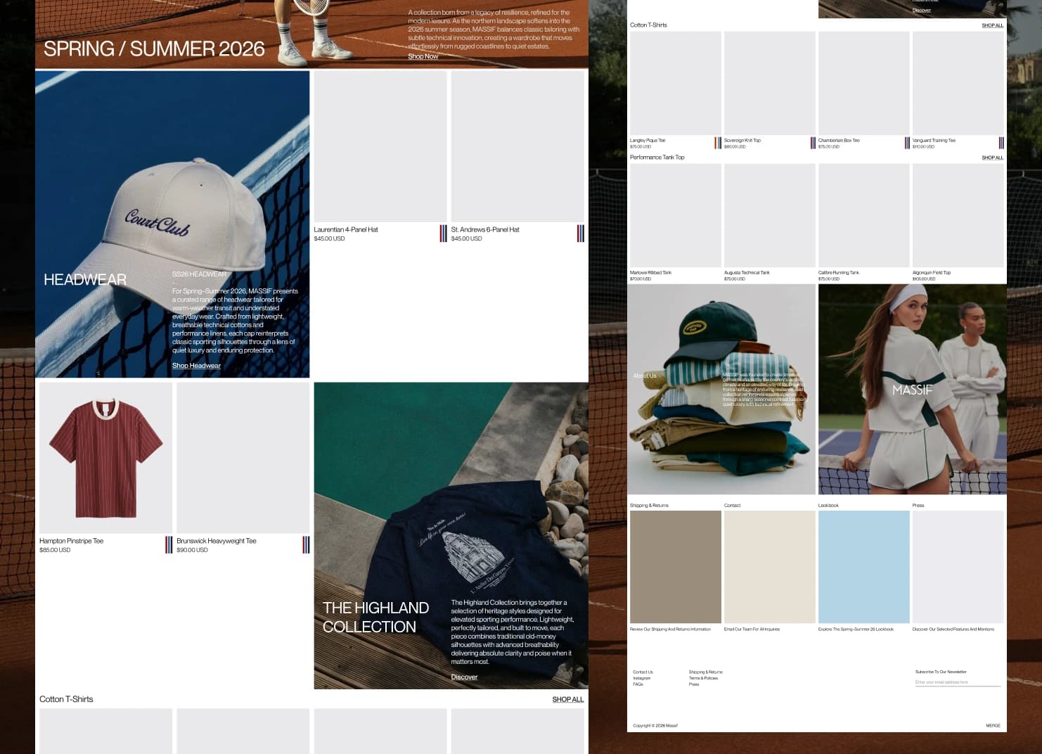
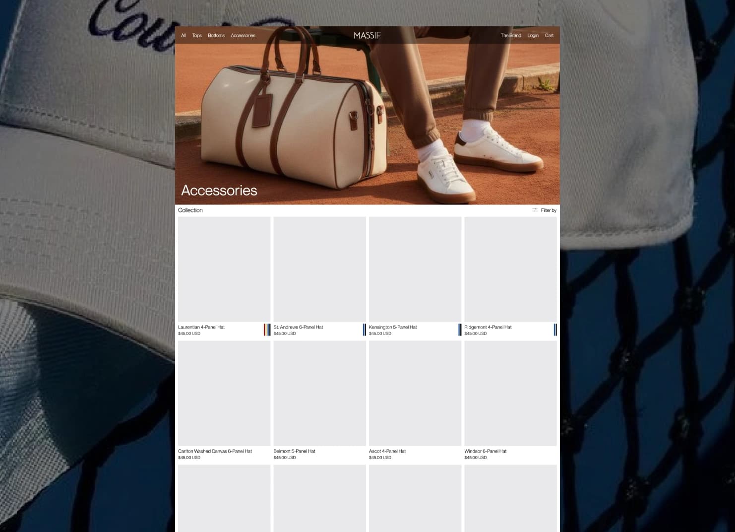
The decision that shapes both the homepage and the category grid is the same one: structure the page so a visitor can take in the current season, the key collections, and the category options in one glance, instead of scrolling to assemble that picture themselves. None of it needed an oversized hero to feel premium the restraint came from spacing and typography, not from hiding content behind a scroll.
Massif Homepage Layout
Massif Category Grid Layout
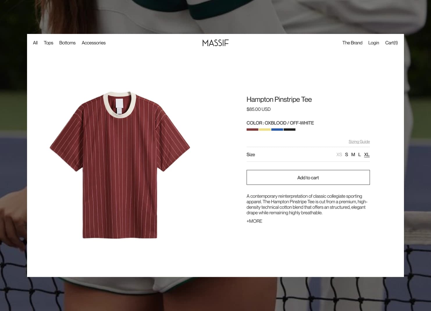
Browsing the garment and deciding to buy it shouldn't compete for the same scroll position
On the Hampton Pinstripe Tee's product page, the photography does what photography should multiple angles, scrollable, taking its time. But price, color, size, and Add to Cart stay pinned in view the entire time, so deciding to buy never requires scrolling back up to find the button again.
Hampton Pinstripe Tee
$85.00 USDColor: Oxblood / Off-WhiteThe sticky panel only works if it doesn't feel like it's following the user so it's anchored to the same vertical rhythm as the gallery, sized to never push past the viewport on its own, and gets out of the way entirely once the gallery ends and the description and sizing details begin below.
Restraint that doesn't cost the visitor any information
View needed to see the current collection, a featured story, and core categories no scroll required to get oriented
Extra taps needed to see price, color, or size while browsing a product's photography the sticky panel keeps it all in view
Core surfaces designed so far homepage, category grid, and product page built on the same restrained system
This was never about adding more to the page it was about making sure nothing the visitor actually needs is one scroll or one click further away than it has to be. The same structural logic now carries across every page built so far, without needing decoration to feel premium.
Got a messy platform or a new idea?
Skip the guesswork. Pick a channel below and let's figure out the smartest UX strategy for your business goals.
Drop a message and I'll get back to you within 24 hours no templates, just a real reply.
SEND A MESSAGE ↗SEND A MESSAGE ↗Follow along for case studies, design breakdowns, and occasional thoughts on building better products.
CONNECT ↗CONNECT ↗