DMT Sri Lanka
Redesigning the Department of Motor Traffic's website after finding that its navigation didn't just confuse people large parts of it led nowhere at all.
This isn't a site people browse for fun. When the navigation breaks, there's no alternative way to get a licence renewed.
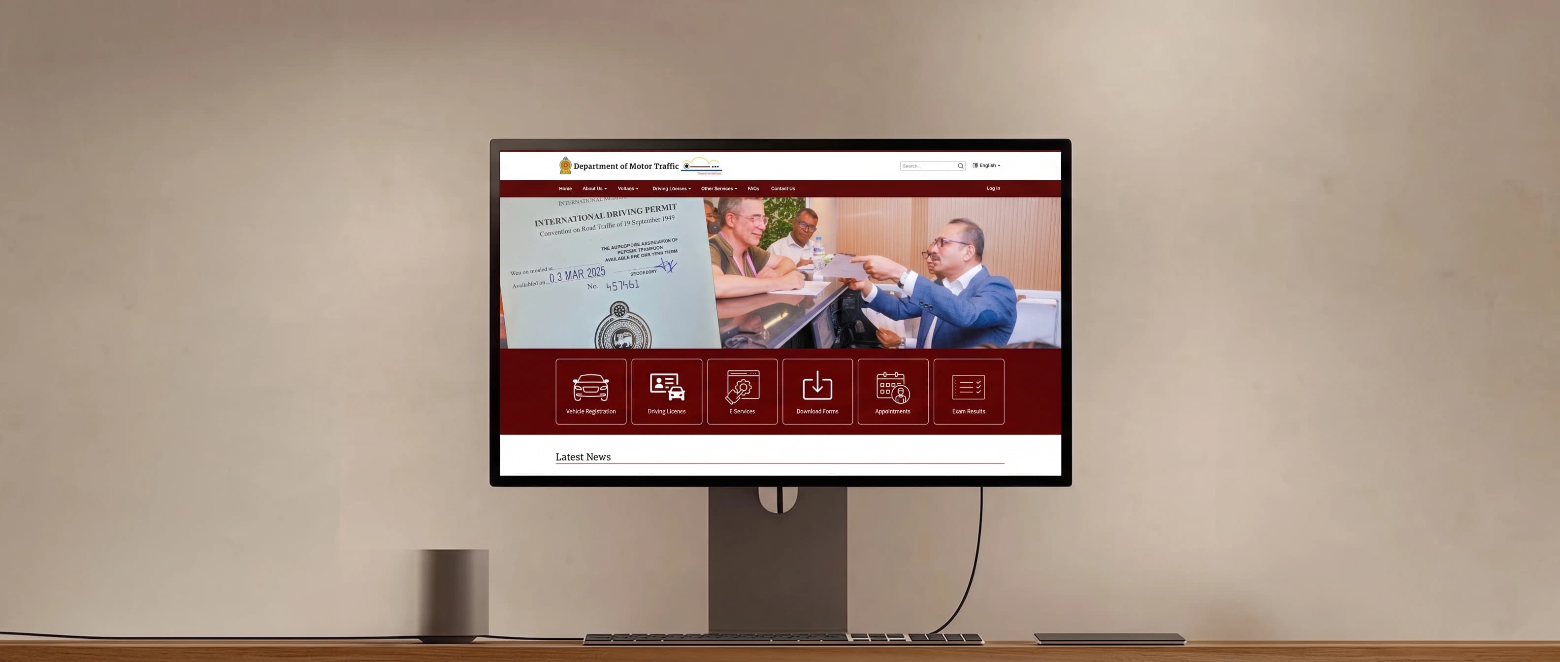
For our HCI module's redesign project, our team chose the Department of Motor Traffic Sri Lanka's website as the real government site to study and rebuild not a hypothetical brief, but a service people are required to use for vehicle registration, driving licences, fines, and exam results.
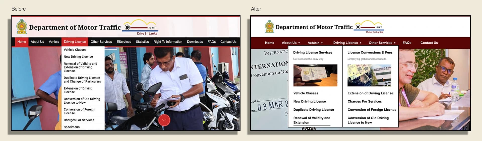
What we found going in wasn't ordinary confusing navigation. Main service categories were duplicated. Their subcategories were duplicated again underneath them. Some of those links led to pages that simply didn't exist names on a menu with nothing built behind them. Every navigation flow we tried to follow as a user broke at some point, with no clear way back to what we were actually looking for.
* Academic case study DMT Sri Lanka is a real government service; this redesign was produced as university coursework and is not an official or commissioned redesign.
A heuristic review told us where it was broken. Interviews told us how badly that broke people's trust.
Our team ran a heuristic evaluation of the existing site against established usability principles, then backed it with interviews across a 25–30 age group of students and employees people who'd realistically need to use a service like this.
Main service categories appeared more than once in the navigation, and their subcategories were duplicated again underneath the same task reachable through several inconsistent paths.
Some menu items led to pages that were never built just a label sitting in the navigation with nothing behind it, and no indication to the user that anything was wrong.
Every task flow we traced as a test user broke down at some point in the nesting, with no consistent way to recover or get back to the actual task.
of interviewed users students and employees aged 25–30 described the site's navigation as confusing, with several specifically citing dead links and not being able to find a service they knew the site offered.
The fix wasn't reorganizing the existing menu. It was refusing to keep most of it.
A duplicated, multi-level menu with dead links inside it isn't a structure worth preserving restructuring it would have just produced a tidier version of the same problem. We flattened it instead: identify the handful of tasks people actually came to do, and put every one of them one tap from the homepage.
We didn't try to rescue the existing hierarchy by deduplicating it in place a cleaner version of a broken structure is still a structure users have to dig through. Flattening it meant the navigation question changed from "which of these menus has what I need" to "is my task one of these six cards," which is a much easier question for a first-time visitor to answer.
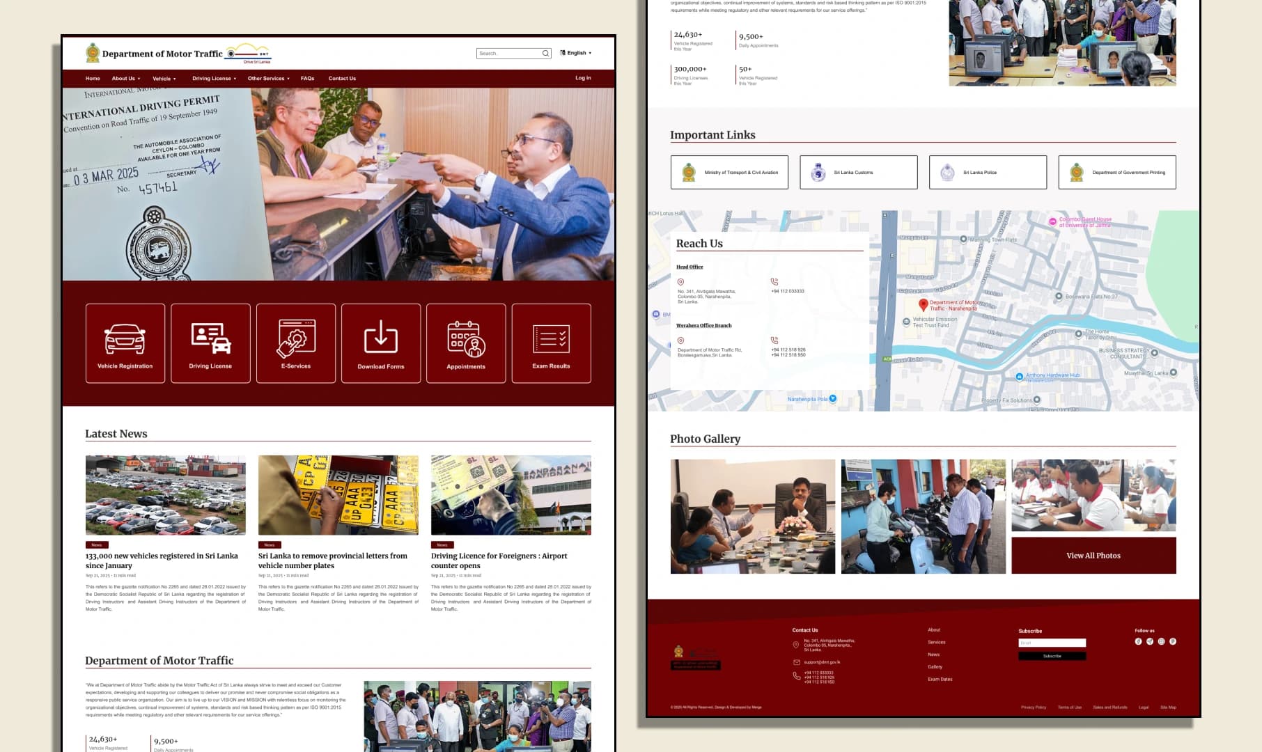
Instead of a navigation menu to interpret, the homepage just asks: which of these are you here for?
The biggest structural decision shows up in the hero itself. Rather than send people into a menu at all, the redesigned homepage puts the six tasks people actually came to the site for directly in front of them as cards, pulled straight from what the interviews told us people needed.
None of these are buried under a category that also has to be decoded first. Each card is a direct, single label for a task, which is the opposite of how the old "Vehicle Services → Registration" style nesting worked, and it's also where the duplicate categories simply stopped mattering there was nothing left to duplicate.
Registration: one flow, three steps, no dead ends
The old site didn't have one registration flow it had several, depending on which duplicate path you landed on. The redesign collapses this into a single three-step flow that adapts based on who's registering and verifies identity before anything gets submitted.
The individual dashboard: everything after registration lives in one place
Once registered, an individual user lands in a dashboard built around four things people actually come back to do: apply for a licence, make a payment, check payment history, and book an appointment.
Booking an appointment was the part most worth designing carefully, since it's where a government site's appointment system usually turns into a guessing game of which day might still have space. The redesign makes availability visible before the user commits to a date.
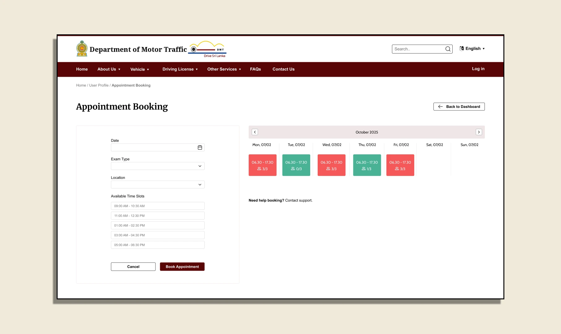
Picking an exam type and location first narrows the calendar to slots that are actually relevant, and showing the booked ratio on each date like 1/3 means a user can see real availability before tapping in, instead of opening a date just to find out it's already full.
Tested against the same people who flagged the problem
The Figma prototype was walked through with people from the same 25–30 age group we'd interviewed during research, tracing the same tasks that broke down on the original site registering a vehicle, checking a fine, finding exam results.
The prototype is publicly viewable, including the click paths for each of the six core tasks, rather than just static screens of the redesigned pages.
From "which menu is it under" to two or three taps
Taps to reach any of the six core services from the homepage, down from a duplicated, multi-level menu
Duplicate categories left in the new structure flattening removed the problem instead of cleaning around it
Real tasks surfaced directly on the homepage, identified from interviews rather than assumed
This was a module project, not a commissioned redesign, so there's no live deployment or production metrics to report. What it did prove, inside the scope of the module, is that the actual fix for a navigation system this broken wasn't better labels on the same structure it was being willing to throw most of that structure out.
Got a messy platform or a new idea?
Skip the guesswork. Pick a channel below and let's figure out the smartest UX strategy for your business goals.
Drop a message and I'll get back to you within 24 hours no templates, just a real reply.
SEND A MESSAGE ↗SEND A MESSAGE ↗Follow along for case studies, design breakdowns, and occasional thoughts on building better products.
CONNECT ↗CONNECT ↗